Looking for high-quality book printing services? Look no further than Rainbow book printing! We offer a variety of paper stocks for both the covers and inside pages of your books, including uncoated, glossy, and matte paper stocks.
Uncoated paper is perfect for environmentalists and those looking to create an old-fashioned look for their books. The absence of a thin film allows ink to be absorbed directly into the paper, making ink dots bigger and creating a slightly sketchy effect. You can even write on uncoated paper easily with a pen or pencil.

Glossy and matte paper both have a thin film laminated on the paper, resulting in sharper text and pictures compared to uncoated paper. They also protect the paper from water drops and smears. Glossy paper is reflective, while matte paper has a dull touch and feel, making it ideal for classic book covers. Both options have a smooth surface for a professional finish. Trust Rainbow Book Printing for all your book printing needs.
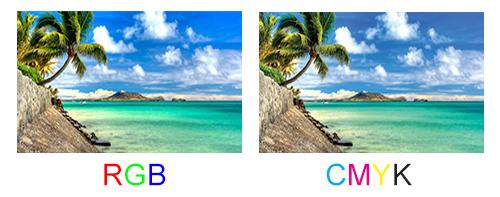
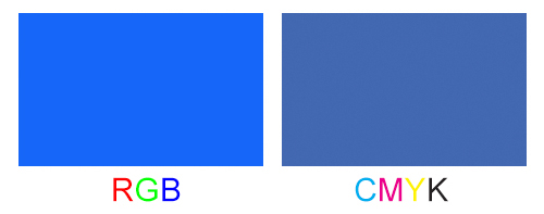
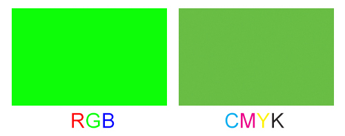
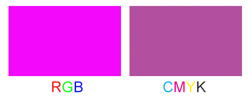
Remember in high school physics we were taught any color can be created by mixing the base colors of red, green, and blue (RGB)? But the RGB mode only applies to light such as the rainbow, sunlight, and light emitting devices such as your LCD screen. In printing industry colors are created by mixing inks. The base ink colors in printing are Cyan, Magenta, Yellow, and BlacK (CMYK). There are many explanations on the web why CMYK mode is used but for practical reason the main reason is that some colors, although exist in RGB mode, cannot be created by mixing any inks in the real world. For example, the RGB of (22, 102, 249) can only be approximated by CMYK of (80, 62, 0, 0). For this reason, it is crucial for you to use CMYK mode when you are doing you design. If you use RGB mode during the design, the printed books might potentially come out with different colors than what you might have expected.
Despite the above warning, RGB to CMYK conversion usually are very slight and sometimes even unnoticeable. Given below are some of the examples. Colors that are most susceptible to color shift are blue, green, and purple.
From our last question and answer ’What is CMYK color mode?’ we know that the K stands for black. If you set the CMYK values to (C=0, M=0 ,Y=0, K=100) your LCD screen will look black. But is it really? As a matter of fact, this black on the screen is pretty misleading. When printed with 100% black only, the color will most likely turn out to be a very dark gray.
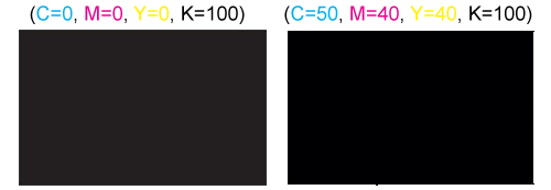
To set a ’really black’ black the CMYK values should be (C=50, M=40 ,Y=40, K=100). With this black both the color on screen and on paper will have such charcoal black. The picture below shows these two blacks side by side to illustrate this point.
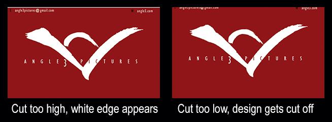
Say you design your business card exactly at the standard size of 3.5" x 2" and print it on a piece of card stock. When you try to cut it out you are facing three possibilities. If you have good eyes and you can aim and align the paper properly on your guillotine trimmer then you can get a perfect cut. But chances are you will cut it either too high or too low. If you cut it too high you will see a white edge unless the background of your design is also white. If you cut it too low you may cut off elements of your design such as logo or text.
To solve these problems you will need bleed and margins.
In printing terms, bleed refers to the area of the artwork extends beyond the trim line. Failure to provide bleed will potentially create a thin strip of unprinted edge as shown in the left of the picture above. This imperfection is caused by the slight shifting of both the cutting blades and the paper. When this slip-up goes against you in the other direction, you may end up having elements of your design got cut off, as shown in the right of the picture above.
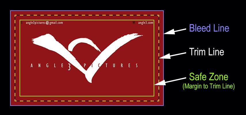
By adding ⅛" of bleed along all the edges, we will reduce or eliminate the chance of having the white strip. By the same token, if we leave enough space between the trim line and the design elements then none of them won’t be cut off either.
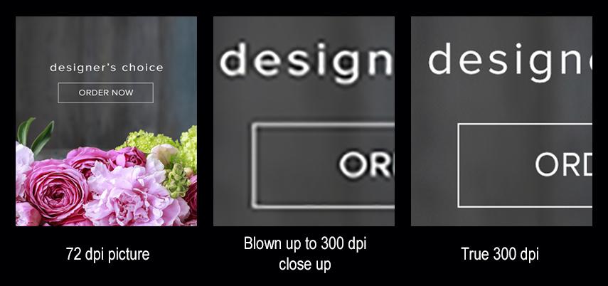
The generally accepted resolution in printing is 300 dpi (dots per inch). With 300 dpi the color dots are dense enough to keep everything looking sharp. "That’s easy", some smart alecks would say: "I can use Photoshop to set any resolution you want." Unfortunately that’s not how it works. We don’t need Stephen Hawking to come to explain that big bang theory does not work in graphic design. If it did, we could start with one single dot and blow it up to 300 dpi to create a butterfly, a beach, a forest. You get my point I hope. Likewise, big bang probably didn’t happen 13.8 billion years ago. How could one pointy mass have exploded to create civilizations, DNA, humanity, etc.?
The picture below shows what happens when you blow up a 72dpi picture to 300dpi and what a true 300dpi should look.
Knowing the thickness of the text block is necessary because it affacts the width of the spine and hence the template for the cover design. Although there is no one-for-all formula to get the exact thickness, we can estimate based on the kind of paper chosen. Use our Book Printing Calculator you can not only calculate the thickness of the book, but also the weight of each book and the over all shipping weight.